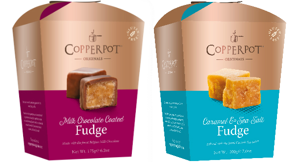
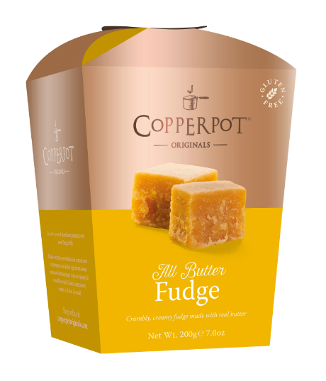
Cornish based confectionery producers, Copperpot Originals, have launched a new look across their luxury fudge and honeycomb range.

Responding to industry innovations and with a strategic aim to target independent retailers and online consumers the new packaging is a direct reflection of the premium product and the newly-aligned brand story.Taking the same shape and dimensions as the previous boxes, the outer uses a touchable copper metallic banding alongside a strong use of colour to connote the different flavours within the range.The decision to use a metallic inks reflects largely on the history of the Coppperpot Originals story, which began in a family kitchen cooking in a traditional copper pan.

Designer James Beresford said:
“When redesigning the packaging for the Copperpot Originals range I wanted to incorporate the classic elements of the brand; made using a copper pan and a three-generation tried and tested family recipe, but also reflect the modern and innovative flavours that the company produce.“The metallic ink adds a visually appealing layer of luxury to the premium products and makes the boxes stand out on the shelf. It is also a very tactile looking box which I think will appeal to customers.”Mark Brian, commercial director said: “I am delighted to see the new packaging on the production line in our St Ives factory. Copperpot Originals was created to showcase the family fudge recipes that have been part of our story since 1978.” “The new packaging is both eye-catching and enticing and we hope will capture the attention of consumers.”
The new packaging is the next step in the brand’s growth strategy after launching online in June 2017. The company are set to release new flavours to sit within the attractive new boxes in spring 2018.
Source: Packaging News


