

The Italian ice-cream brand, which turns 60 next year, has launched a “simplified” new look created by Design Bridge that aims to appear “younger and fresher”.
Design Bridge has given ice-cream brand Cornetto a new look by simplifying the logo, incorporating a new colour palette and redesigning the packaging.
Cornetto is owned by Wall’s, which is in turn owned by Unilever, and the name translates to “little cone” in Italian. First produced in Spica, Italy in 1959, the brand coined the process of insulating a waffle cone using chocolate, oil and sugar, which stops ice-cream leaking out during the manufacturing process.

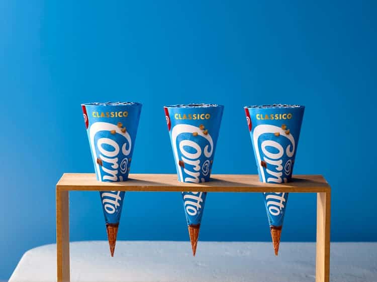
The new branding features a redrawn, “simplified” version of the existing calligraphic logotype, set in white. The former brown background has been dropped, the type has been refined, and the logo now has a screen-printed effect, with faded parts appearing on the logo and packaging.
The Wall’s heart symbol has been used more consistently across communications and a smaller colour palette has been incorporated, with white and gold used consistently, plus a colour to indicate the ice-cream flavour.
The packaging has been stripped of extra copy, and is now one uniform colour to represent the flavour variant. This includes blue, brown, orange, green, two shades of red and pink for seven different flavours. Individual packaging for the ice-cream cones features photography of the waffle cones printed on it, replicating what is inside the packet.

Mike Stride, creative director at Design Bridge, says: “We kept the ‘creaminess’ and fluidity of the logo but made it simpler to give it a younger, fresher feel. We stripped it of its synthetic and artificial effects [and] this is combined with a new, natural texture on pack that adds a further sense of realness and tactility to the design.”
The new look aims to be more “playful”, Stride adds, with slogans such as “keep in the freezer (and close to your heart)” incorporated, and through overlapping product photography with the logo.
New product photography has also been used, which looks to be more “natural” rather than “hyper-realistic”, he says.
The new design will be used worldwide to unify existing, disparate branding in different countries, and will create “consistency”, the design consultancy says.
The new look is currently rolling out across on-shelf packaging, print materials such as a brand book and advertising, and online platforms.
Source: Design Week